
A visitor can understand a SaaS product and still hesitate to take the next step. The page may ask for too much commitment, hide an important condition, or show a polished interface without explaining how it helps. Conversion review starts by understanding that hesitation.
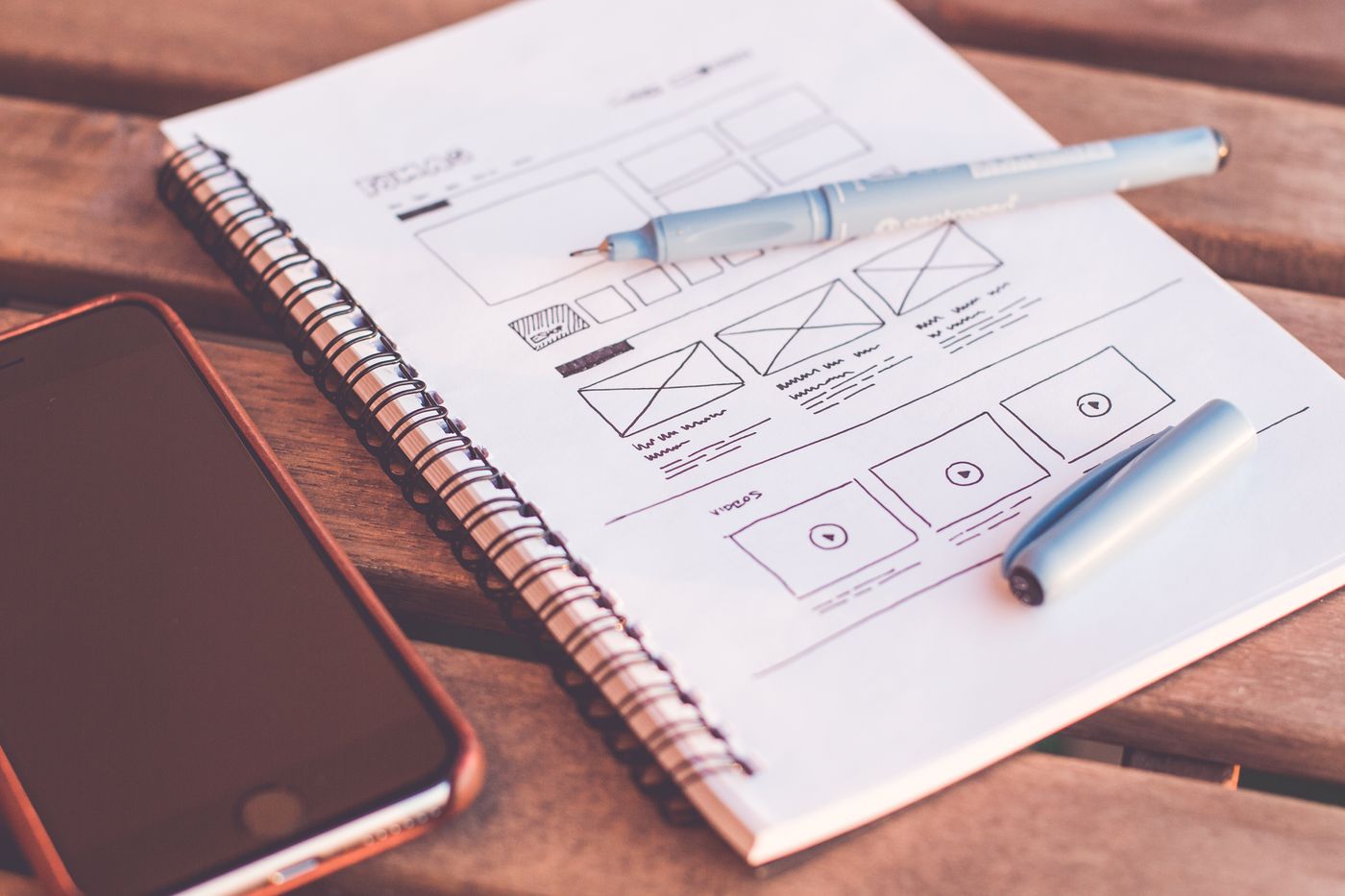
This article turns landing-page optimisation into a structured audit of the buying experience. It connects the promise, product demonstration, trust evidence, calls to action, and post-submission expectation. The purpose is a clearer decision journey, not a collection of tricks designed to increase button clicks.
Define the outcome that actually matters
Decide which action the page is meant to support. An early-stage product may seek relevant early-access requests; a self-serve product may need qualified activation; an enterprise offering may require a conversation with the right stakeholder. These outcomes are not equivalent.
Distinguish an intermediate action from the business outcome. A button click can identify interest, but it does not prove that the person completed the form, understood the offer, or became a suitable customer. Write down the journey you intend to measure before changing the page.
Check whether the promise survives a quick reading
Read only the headline, subheading, and primary CTA. Can you identify the product, the intended audience, and the next action? If the answer depends on abstract phrases such as “transform your future,” the page may require too much interpretation.
Replace broad claims with an explanation of the problem and mechanism. Do not introduce an impressive percentage unless the organisation has evidence for it. A specific description of what the software helps a team do can be more persuasive than an unsupported claim about the size of the outcome.
Show the product in a meaningful situation
A screenshot should answer a question. A workflow image can show how a task begins, what information appears, and what action follows. Give readers enough context to understand the significance of the interface rather than asking them to admire it.
Label examples and avoid implying that sample results are customer evidence. A short demonstration can explain a capability, while a documented case study can support an outcome. Keep those roles distinct. Use accessible text to preserve the main explanation when the visual cannot be seen.
Match CTAs to the visitor’s decision
Choose one clear primary action and use supporting actions where they answer a different need. A visitor may want to understand the platform before requesting access. Another may already have enough context and need a direct route to the form.
Make the button describe what happens next. “Request early access” sets a different expectation from “Start using the platform.” The destination should honour that expectation and carry relevant context forward. Do not advertise an instant audit, trial, or download unless that experience actually exists.
| Visitor question | Useful response | Suitable next step |
|---|---|---|
| What does it do? | A clear product explanation | Explore the platform |
| How would my team use it? | A contextual workflow | View team solutions |
| Is it appropriate for us? | Scope and limitations | Request early access |
| What happens after I submit? | A plain explanation of the process | Complete the enquiry |
Review friction at the form and the handoff
Ask why each field is required. Some information is necessary to assess fit, while other details can wait for a later conversation. Check labels, validation, mobile usability, error messages, and whether a failed submission preserves the information the person entered.
Explain what happens after a successful request. Avoid a celebratory message that promises an email or meeting the system will not send. The confirmation is part of the conversion experience: it should acknowledge the action accurately and offer a useful next destination.
Test a hypothesis rather than a preference
Use evidence to frame the proposed change. For example, the team may believe that explaining implementation requirements will reduce unsuitable enquiries. Define the relevant measure and any trade-off before running the experiment. A prettier button is not, by itself, a hypothesis about buyer behaviour.
Interpret results in the context of traffic quality and volume. Small samples can be misleading, and an increase in enquiries can be unhelpful if fit declines. Uplithic’s conversion assessment can surface issues for investigation; the team still needs to validate proposed changes against real users and appropriate business measures.
Frequently asked questions
Should a page have only one CTA?
It should have one clear primary action. Supporting CTAs can serve different levels of readiness, provided they do not compete confusingly with the main journey.
Are shorter forms always better?
Not necessarily. Remove unnecessary friction, but retain information genuinely needed for the next step. Measure enquiry quality as well as completion.
Can a conversion audit predict an uplift?
It can identify problems and hypotheses. A reliable uplift claim needs suitable evidence from implementation and measurement, not just an assessment.